My Account


 Gift Cards
 Film Index
 FAQ
FAQ 35mm
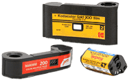
35mm 120/220
 Single Use Cameras
 110/126/Advantix
 Sheet Film

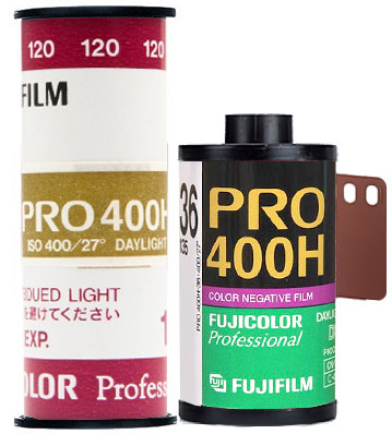 FUJIFILM Pro400H Film
chemical name of lasix
They stayed in Bangkok for three nights before moving to Chiang Mai in the north, where they also stayed for three nights lasix without prescription
Good in all conditions
Nice color without being overly saturated. Nice contrast. Handled bright sunny conditions well but better in even light. I used it for landscapes, nature shots, car shows, and some portraits. Very nice overall results. Very low grain.
Love it. Better than Portra 400 for me.
Skin tones are spot on. Everything looks natural. I haven’t had that luck with Portra.
Great for outdoor scenes
Really lovely film to work with when there are lots of blues and greens. Skin tones can be problematic though. Overall a nice film with a desaturated palette.
my all time favourite...
I just love this film, especially in 120. From the 1st day I shot this. Love the overall color and “tonality”, skin-tones are beautiful, latitude is amazing, grain is nice … very happy every time I shoot it. So for someone that does not like the “warm” look and Saturation of Porta this is the Film to get. Sadly it’s a bit harder to get (in Germany) and also a bit pricy, still i’ll always choose this film for all of my Color-Projects, especially in 120
why does this film have zero stars? It is amazing
This is an amazing film, beautiful pastel skin tones, nice greens and browns. Looks great overexposed. Nice grain! What more can you ask for? A lovely alternative to portra👍